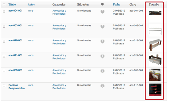
avatar

Andres Jaimes

About Me

I am a Cloud, REST API, and microservices back-end/full-stack developer, fluent in Scala, Java, C#, JavaScript, SQL, NoSQL, and ElasticSearch, who loves FreeBSD, Linux, Docker and AWS. I started programming web pages when bright-colored-blinking gifs dominated the internet. That new place where Geocities ruled. Those were the times when creating a simple contact form required a CGI program using C or C++, Boutell’s CGIC library, and the Netscape Composer. I am a big fan of the Mario Bros saga and an avid player of The Legend of Zelda: Breath of the Wild.

Multi-Device Layout Patterns

Through fluid grids and media query adjustments, responsive design enables Web page layouts to adapt to a variety of screen sizes. As more designers embrace this technique, we’re not only seeing a lot of innovation but the emergence of clear patterns as well. I cataloged what seem to be the most popular of these patterns for adaptable multi-device layouts. To get a sense of emerging responsive design layout patterns, I combed through all the examples curated on the Media Queries gallery site several times.

Old school: Use xcopy to back up your stuff

Need an easy way to back up your files, but don’t feel like monkeying with expensive or complicated software? Using the xcopy command and a simple text file, you can accomplish this rather easily. Here’s what I do. First, make sure that file extensions are not hidden by going to My Computer > Tools > Folder Options > View. Uncheck Hide Extensions for Known File Types and click OK (if it’s already unchecked, don’t worry about it).

Ten Laws to Design By

As designers we have to be aware of the function of our work and design as much as we care about the aesthetics and visuals. There are a lot of terms for the design of how the site functions and works, from “usability design” to “user experience,” what remains constant is that if we want to become better designers we have to pair these two concepts together. Using clear and effective design laws as guides we can use proven formulas for better design.

Desprotegido…

No fue hasta que un señor de cincuenta y tantos años, cuyo padre recientemente falleció, que entendí la importancia de sentirnos cerca de nuestros padres, pues me dijo “ahora sí me siento desprotegido”…

Coding An HTML 5 Layout From Scratch

HTML5 and CSS3 have just arrived (kinda), and with them a whole new battle for the ‘best markup’ trophy has begun. Truth to be told, all these technologies are mere tools waiting for a skilled developer to work on the right project. As developers we shouldn’t get into pointless discussions of which markup is the best. They all lead to nowhere. Rather, we must get a brand new ideology and modify our coding habits to keep the web accessible.

Redistribute your webpage contents to fit your browser width

Are you tired of dealing with different screen sizes for your web pages? Well, this information is for you. I will show you some CSS tricks to help you reorganize a webpage depending on your browser window width. We will start with a simple HTML 5 skeleton that includes a contents and a navigation section: <!DOCTYPE html> <html lang="en"> <head> <style> /* we will add our style here on the next step */ </style> </head> <body> <div role="main"> <h1>This is the contents</h1> <p>Lorem ipsum dolor sit amet, consectetur adipiscing elit.

An easy way to do a CSS Horizontal Menu

Here it is. Start with a conventional item list like the following: <ul class="hmenu"> <li><a href="">Option 1</a></li> <li><a href="">Option 2</a></li> <li><a href="">Option 3</a></li> <li><a href="">Option 4</a></li> <li><a href="">Option 5</a></li> </ul> Don’t forget to add the class parameter to the ul tag – that will help us do the magic. The previous list is rendered in a regular browser like the following: Now, add the following CSS to your file: .hmenu { margin: 0; padding: 0; list-style-type: none; list-style-image: none; } .

CSS – Attribute selectors

Attribute selectors allow you to select CSS elements based on their attributes or values. For example, if you want to select an image named “great.gif” you can do it by using the following rule: img[src="great.gif"] { border: 3px solid #000; } There are four types of selectors. By attribute. The following example will select all the images that contain the given attribute: img[title] { border: 3px solid #000; } img[width] { border: 3px solid #000; } img[alt] { border: 3px solid #000; } By value.

Create a DNS zone file

by FreeBSD.orgAn example master zone file for example.org(existing within /etc/namedb/master/example.org) is as follows: $TTL 3600 ; 1 hour default TTL example.org. IN SOA ns1.example.org. admin.example.org. ( 2006051501 ; Serial 10800 ; Refresh 3600 ; Retry 604800 ; Expire 300 ; Negative Response TTL ) ; DNS Servers IN NS ns1.example.org. IN NS ns2.example.org. ; MX Records IN MX 10 mx.example.org. IN MX 20 mail.example.org. IN A 192.168.1.1 ; Machine Names localhost IN A 127.